
Wednesday, 8 December 2010


Evaluation question 7

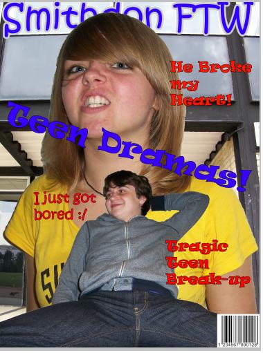
As you can see in the difference between my music magazine on the left and my preliminary task on the right, i have learnt SO much! I have learnt how the fonts have meaning behind them so i need to select them carefully to get across the right message and to reach my target audience. I have also learnt how to edit my pictures a lot better. My original school magazine is very basic photoshop skills and not much went into it apart from placing them on top of each other. where as in my music magazine a lot more effort went into editing the image in ways to get across to my target audience.
I also learnt that i shouldn't make my bar code as prominent like it is in the school magazine. instead make it quite small in the bottom right. This is because i want all the attention on main image and story lines.
My music magazine also has a very glossy look unlike my school magazine which looks cramped and quite unprofessional. This has shown how i have improved greatly as a media student.
Evaluation question 6
In the construction of my product i have learnt so much, specifically in photoshop. I learnt that is is best to put everything that i am doing onto a separate layer so when it comes to editing my final piece it is a lot easier because everything is sectioned out very clearly. I have also learnt how to crop images effectively and move them from file to file, specifically my front cover. I placed my main image of Megan onto a black and white background of a metal fence to connote that prison is behind her. Colour adjustments are also another thing i learnt to do. I now know how to make skin brighter or make things black and white, by simply selecting them and going onto the adjustments option and changing as i see fit.
Another technology i learnt about is the use of a camera. I learnt about the different features of a camera, e.g. for close up or long range shots and also stopping the lighting in the room effecting the picture. I also learnt about low and high angles and the meaning behind them. Low angles makes the person or item look intimidating or to have authority. A high angle shot could connote that the person is "in a hole" and needs to get out and back on top. I also found out that mid shots work best for my magazine because it gives enough facial detail to give a lot of meaning and it is far enough away to show body action which would also denote and connote meanings.
I also learnt about Adobe in design. This is a very good programme that is used by professionals to give a fully glossy effect. It allows me to put in a lot of things that professional music magazines would use e.g. bleed marks.
Another technology i learnt about is the use of a camera. I learnt about the different features of a camera, e.g. for close up or long range shots and also stopping the lighting in the room effecting the picture. I also learnt about low and high angles and the meaning behind them. Low angles makes the person or item look intimidating or to have authority. A high angle shot could connote that the person is "in a hole" and needs to get out and back on top. I also found out that mid shots work best for my magazine because it gives enough facial detail to give a lot of meaning and it is far enough away to show body action which would also denote and connote meanings.
I also learnt about Adobe in design. This is a very good programme that is used by professionals to give a fully glossy effect. It allows me to put in a lot of things that professional music magazines would use e.g. bleed marks.
Evaluation question 5

To attract my audience i used specific language. I used language that would make readers want to read the articles in full depth. Words like "Dilema", "scandal" and "blitz". These types of words are all interesting words that make readers want to read the entire magazine or atleast a specific article to see what is so scandalous.
I used a big read title on my front cover naming the magazine "Generation" to attract consumers eyes on the shelf. The size and boldness of it will make it easily stand out from other magazines around it.
The big picture of Megan, my main model on the front cover and double page spread, would definetly attract readers eyes. this is because she is wearing a red dress which is a very noticable colour and would again make it stand out among other magazines.
I also have a slogan on the front cover, "A New Start" this is catchy and would stick in readers minds as soon as they see it. it is also mysterious because it doesn't go into any detail apart from that she maybe did something wrong in her past and is now making a come back.
The big sparkling rose on Megan's hat would also attract an audience because it is very eye catching because it almost sparkles so it would be very hard for a reader to miss it.
Evaluation question 4
The audience for my magazine would be young female adults aged 16 - 24 that like punk/pop. I have attracted them by using a specific font, "action of time", because it looks like graffiti on a wall. This is relatable to people who are into punk because it is rebelious which plays a big part in punk culture. I have made sure that teh rebelion didn't make it masculine and attract men to it by making it red. This would be effective because red is the most emotionally intense colour. A typical U.K male wouldn't be attracted to emotionally charged magazines, instead women are usually attracted to it.
I have included stories that are relevant to todays youth instead of more adult or elderly problems. Things like drug problems and other things like "temptation", which is mentioned in my contents page, are all things that would appeal to my target audience.
Black and white has also been a huge role in my magazine, it is the background on my front cover and contents page. I have done this because black is very popular in todays fashion which women would be concious of. White is also very popular in fashion because women consider it to "go with everything" and therefore together black and white, in womens opinion, will look good. Black and white also contrast eachother very well, this could connote that there is a conflict going on, specifically in my magazine where it is about people not believing Megan can change and Megan wanting to prove herself to everyone.
I have included stories that are relevant to todays youth instead of more adult or elderly problems. Things like drug problems and other things like "temptation", which is mentioned in my contents page, are all things that would appeal to my target audience.
Black and white has also been a huge role in my magazine, it is the background on my front cover and contents page. I have done this because black is very popular in todays fashion which women would be concious of. White is also very popular in fashion because women consider it to "go with everything" and therefore together black and white, in womens opinion, will look good. Black and white also contrast eachother very well, this could connote that there is a conflict going on, specifically in my magazine where it is about people not believing Megan can change and Megan wanting to prove herself to everyone.
Subscribe to:
Posts (Atom)