Friday, 15 April 2011
Youtube Talent Funds
"YouTube is to invest €500,000 (£441,000) in a scheme to support UK digital talent. The YouTube NextUp fund will allow up to 25 people to win a €20,000 grant to develop their content on the video-sharing website, as well as a place at a "creator camp" that will give training in production techniques. To apply, creators must be YouTube partners – content producers who earn revenue through their accounts. YouTube said they could include singers, dancers, actors, producers, musicians or makeup artists who create their own video content." I found this story on the guardian website. This is, potentially, a new way for musician to become well known in the music world. This could also lead to musicians getting record deals with both major or minor labels.

Thursday, 14 April 2011
Spotify limits it's free use!
I was browsing the guardian website and I came across an article about Spotify. I thought this would greatly help in our case study. A little bit of knowledge to chuck in the exam haha. Well as i read it i found out that they are trying to launch themselves in America. (America arn't to keen on the idea of people listening to that amount of music for free) To sell themselves to America they have decided to limit the use of free music to its users and to hopefully boost its paying members.
Here is a quote that I hope will be helpful to everyone
"To put it bluntly: Spotify is cutting the amount of free music people can listen to in order to please the American labels with which it is agonisingly negotiating to try to get permission to launch in the US. The fact is that the labels there – and for that matter in Europe – don't like Spotify allowing people to listen to so much music for free (even though Spotify pays them the stipulated amount per track, whether the customer is listening for free or on a paid subscription)."
Creative commons
http://www.youtube.com/watch?v=io3BrAQl3so
Just thought I would share this with everybody. It made the very complicated idea of Creative commons (cc) relatively easy to understand :).
Wednesday, 8 December 2010


Evaluation question 7

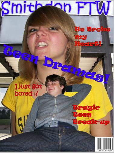
As you can see in the difference between my music magazine on the left and my preliminary task on the right, i have learnt SO much! I have learnt how the fonts have meaning behind them so i need to select them carefully to get across the right message and to reach my target audience. I have also learnt how to edit my pictures a lot better. My original school magazine is very basic photoshop skills and not much went into it apart from placing them on top of each other. where as in my music magazine a lot more effort went into editing the image in ways to get across to my target audience.
I also learnt that i shouldn't make my bar code as prominent like it is in the school magazine. instead make it quite small in the bottom right. This is because i want all the attention on main image and story lines.
My music magazine also has a very glossy look unlike my school magazine which looks cramped and quite unprofessional. This has shown how i have improved greatly as a media student.
Evaluation question 6
In the construction of my product i have learnt so much, specifically in photoshop. I learnt that is is best to put everything that i am doing onto a separate layer so when it comes to editing my final piece it is a lot easier because everything is sectioned out very clearly. I have also learnt how to crop images effectively and move them from file to file, specifically my front cover. I placed my main image of Megan onto a black and white background of a metal fence to connote that prison is behind her. Colour adjustments are also another thing i learnt to do. I now know how to make skin brighter or make things black and white, by simply selecting them and going onto the adjustments option and changing as i see fit.
Another technology i learnt about is the use of a camera. I learnt about the different features of a camera, e.g. for close up or long range shots and also stopping the lighting in the room effecting the picture. I also learnt about low and high angles and the meaning behind them. Low angles makes the person or item look intimidating or to have authority. A high angle shot could connote that the person is "in a hole" and needs to get out and back on top. I also found out that mid shots work best for my magazine because it gives enough facial detail to give a lot of meaning and it is far enough away to show body action which would also denote and connote meanings.
I also learnt about Adobe in design. This is a very good programme that is used by professionals to give a fully glossy effect. It allows me to put in a lot of things that professional music magazines would use e.g. bleed marks.
Another technology i learnt about is the use of a camera. I learnt about the different features of a camera, e.g. for close up or long range shots and also stopping the lighting in the room effecting the picture. I also learnt about low and high angles and the meaning behind them. Low angles makes the person or item look intimidating or to have authority. A high angle shot could connote that the person is "in a hole" and needs to get out and back on top. I also found out that mid shots work best for my magazine because it gives enough facial detail to give a lot of meaning and it is far enough away to show body action which would also denote and connote meanings.
I also learnt about Adobe in design. This is a very good programme that is used by professionals to give a fully glossy effect. It allows me to put in a lot of things that professional music magazines would use e.g. bleed marks.
Evaluation question 5

To attract my audience i used specific language. I used language that would make readers want to read the articles in full depth. Words like "Dilema", "scandal" and "blitz". These types of words are all interesting words that make readers want to read the entire magazine or atleast a specific article to see what is so scandalous.
I used a big read title on my front cover naming the magazine "Generation" to attract consumers eyes on the shelf. The size and boldness of it will make it easily stand out from other magazines around it.
The big picture of Megan, my main model on the front cover and double page spread, would definetly attract readers eyes. this is because she is wearing a red dress which is a very noticable colour and would again make it stand out among other magazines.
I also have a slogan on the front cover, "A New Start" this is catchy and would stick in readers minds as soon as they see it. it is also mysterious because it doesn't go into any detail apart from that she maybe did something wrong in her past and is now making a come back.
The big sparkling rose on Megan's hat would also attract an audience because it is very eye catching because it almost sparkles so it would be very hard for a reader to miss it.
Evaluation question 4
The audience for my magazine would be young female adults aged 16 - 24 that like punk/pop. I have attracted them by using a specific font, "action of time", because it looks like graffiti on a wall. This is relatable to people who are into punk because it is rebelious which plays a big part in punk culture. I have made sure that teh rebelion didn't make it masculine and attract men to it by making it red. This would be effective because red is the most emotionally intense colour. A typical U.K male wouldn't be attracted to emotionally charged magazines, instead women are usually attracted to it.
I have included stories that are relevant to todays youth instead of more adult or elderly problems. Things like drug problems and other things like "temptation", which is mentioned in my contents page, are all things that would appeal to my target audience.
Black and white has also been a huge role in my magazine, it is the background on my front cover and contents page. I have done this because black is very popular in todays fashion which women would be concious of. White is also very popular in fashion because women consider it to "go with everything" and therefore together black and white, in womens opinion, will look good. Black and white also contrast eachother very well, this could connote that there is a conflict going on, specifically in my magazine where it is about people not believing Megan can change and Megan wanting to prove herself to everyone.
I have included stories that are relevant to todays youth instead of more adult or elderly problems. Things like drug problems and other things like "temptation", which is mentioned in my contents page, are all things that would appeal to my target audience.
Black and white has also been a huge role in my magazine, it is the background on my front cover and contents page. I have done this because black is very popular in todays fashion which women would be concious of. White is also very popular in fashion because women consider it to "go with everything" and therefore together black and white, in womens opinion, will look good. Black and white also contrast eachother very well, this could connote that there is a conflict going on, specifically in my magazine where it is about people not believing Megan can change and Megan wanting to prove herself to everyone.
Tuesday, 7 December 2010
Evaluation question 3

The media instituation I would select to sell my music magazine would be IPC Media, specifically their "IPC Connect" section. This is because this section specialise in reaching women through their magazines. This section of IPC alone reaches out to 53% of all mass market women. That is around 10 million women.

IPC also have many other magazines that they distribute, which include a very popular magazine called NME. NME target the same age range, 16-24, as i do. This is another reason why i would select IPC to distribute my magazine, because they would already have knowledge on how to fully market my magazine. Also it would appeal to them because they would be extending an already popular and successful section of their company.
Sunday, 5 December 2010
Evalutation question 2
The genre of my magazine is pop/punk. I decided to go with this genre because it will stand out with todays teenagers. I chose to target teenagers and young adults around the age range of 16-24 because these are the main ages in our days that buy music magazines. I have represented this age range by using a picture of a girl in this age range on my front cover and double page spread. I have also represented this age range by using the colour black which is a very rebelious colour, and this is the age where people rebel and change within themselves. Another way i represent this age range is in my double page spread with the facial expression she had. She has a sort of cheeky grin which makes her look like she has done something wrong and is slightly smug about it. This is easily relatable to my age range.
In specific social grades i have decided to target the C1 and C2 grades. This is because my price of £2.40 is easily affordable to a typical working class family once a week. Also the type of language and storys that i cover are easily relatable to these classes e.g. drug problems on streets.
I have decided to target my magazine toward females. I did this by using a girl that doesn't have her body on show which is typical to male magazine. Instead she is in a pretty red dress which women would like to own. My aim was to hopefully make them envy her style which includes her make up too. Her mascara was very defined which made her eyes stand out, women tend to notice these things where as men would only see a pretty girl.
In specific social grades i have decided to target the C1 and C2 grades. This is because my price of £2.40 is easily affordable to a typical working class family once a week. Also the type of language and storys that i cover are easily relatable to these classes e.g. drug problems on streets.
I have decided to target my magazine toward females. I did this by using a girl that doesn't have her body on show which is typical to male magazine. Instead she is in a pretty red dress which women would like to own. My aim was to hopefully make them envy her style which includes her make up too. Her mascara was very defined which made her eyes stand out, women tend to notice these things where as men would only see a pretty girl.
Evaluations question 1
In this media project i was asked to create a front page, a contents page and a double page spread of a music magazine. I have stuck to forms and conventions of other magazines in various ways and also challenged them in other ways. I decided to have my title of the magazine at the top of the page in the middle like other music magazine, and also i have my main image slap band in the middle spreading over the whole page. Both these are examples of sticking to codes and conventions of other magazine. I also only used 3 main colours, black white and red, which is very usual to magazine. I chose to do this because in my backround research i saw that many magazines only used 3 main colours and the mainly used these colours. They use black and white because they contrast eachother which works well, and the red is used to make it stand out on a shelf. This is why my main title of the magazine was red, because it is very noticable and will stand out on a shelf. I decided to also have my bar code in the bottom right hand corner where they usually are on other magazine.
I challenged the usual codes and conventions by having the main title slightly behind the main image, this was effective i believe because it is not usual and is unique. The outer shadow around the main title helps it stand out so the reader still knows what magazine it is.
I had my main model in a top hat which is typically masculine, but she had a rose on her head which is feminine. This challenged the forms and conventions because it isn't what you would usually find in a magazine, but it does make it stand out among other magazine. The final challenge to the usual forms and conventions was that i put negative quotes on her hand shaped as a gun to connote the doubt that she has made a true reform and a positive quote above the rose to show that she would truely make it in the world of music.
I challenged the usual codes and conventions by having the main title slightly behind the main image, this was effective i believe because it is not usual and is unique. The outer shadow around the main title helps it stand out so the reader still knows what magazine it is.
I had my main model in a top hat which is typically masculine, but she had a rose on her head which is feminine. This challenged the forms and conventions because it isn't what you would usually find in a magazine, but it does make it stand out among other magazine. The final challenge to the usual forms and conventions was that i put negative quotes on her hand shaped as a gun to connote the doubt that she has made a true reform and a positive quote above the rose to show that she would truely make it in the world of music.
Tuesday, 16 November 2010
Terra Firma vs Citigroup

A New York jury has found in favour of Citigroup in its legal battle with Terra Firma boss Guy Hands, over the company’s selling of EMI in 2007.
Hands had claimed that Citigroup’s David Wormsley had misled him in the run-up to the deal being finalised, convincing Terra Firma that it was in a bidding war when, in fact, rival bidders had pulled out. So, Citigroup won and Guy Hands lost. However, the real question now is whether the outcome will continue to have a destabilising effect on EMI itself, which has been facing the same business challenges as its rival music companies with the added distraction of the Terra Firma / Citigroup clash.
Hands had claimed that Citigroup’s David Wormsley had misled him in the run-up to the deal being finalised, convincing Terra Firma that it was in a bidding war when, in fact, rival bidders had pulled out. So, Citigroup won and Guy Hands lost. However, the real question now is whether the outcome will continue to have a destabilising effect on EMI itself, which has been facing the same business challenges as its rival music companies with the added distraction of the Terra Firma / Citigroup clash.
Tuesday, 9 November 2010
My chosen music magazine front cover image.

This is the image i have decided to use for various reasons.
Firstly i have a woman looking away from the camera with a hand pointing at her head. The hand shape connotes a gun. The fact that she is facing away from the gun shape means that she is ignoring speculation on her and anyone trying to bring her down, she simply wants to get back on top of the music world.
I chose a woman with black coloured hair because this would connote mystery evoking a sense of potential and possibility. This would be sort of silver lining on the cloud, that even though things are grim, there is always that possibility.
The black nails on the end of her fingers are also important. They connote evil and maybe anger against her. The gun shape hand connote people that are against her, either the public or fellow musicians.
I chose her to be in a pink dress because this is quite a good colour for a female, and also to signify peace and calmness. The pink dress connotes that she doesn't want to be a fighter anymore and she no longer wants to do things on her own. Instead she wants peace in her life and maybe wants to find someone to share it with, this is because pink can also signify love and passion.
Sunday, 31 October 2010
Kerrang double page spread

This double page spread is very much halloween based. The main image stands out and also looks rather scary whith the makeup they are wearing. The positioning of their hands and their postior suggests that they are evil in ways and are "up to no good". This could relate to the type of music in this issue of the magazine.
The image and text are kept very much apart. This is to make sure that the image stands out as much as possible.
The main colours used in this is green, white and black.
The image and text are kept very much apart. This is to make sure that the image stands out as much as possible.
The main colours used in this is green, white and black.
The green was used because it is a traditional halloween colour, it is spooky and can also signify slime which is also another halloween tradition.
The black was used as a backround for the white text. The white text is used to lighten up the article a little bit, because it is a scary double page spread, for young children, and would hopefully take away some of the suspense within the article.
NME double page spread

The main image and the text have been separated to most likely ensure that the reader doesnt get confused by overlapping text and images.
The main image is of a man who is definetly posing to the camera. His pose signifies power and a demand for respect.
The main title uses the word "throne" which re-enforces the signified meaning behind the image, that he has a lot of power.
The main colours used are three simple colours to not distract the reader from the main image and title.
One of the colours is red which is used in teh backround. This is a very attractive backround which will attract the readers eyes.
The next colour is white. The white is to be a backround for the text to make it look more attractive. The black is used for the text, this is a good contrast.
One of the colours is red which is used in teh backround. This is a very attractive backround which will attract the readers eyes.
The next colour is white. The white is to be a backround for the text to make it look more attractive. The black is used for the text, this is a good contrast.
Kerrang contents page

This contents page has a very interesting main image. It is a halloween issue so it has a man dressed up in a scary outfit. This is most probably to signify the danger and anger within this man's music.
The top half also shows smaller images of double page spreads that are withheld in the magazine. This would be like a tease so the reader will definetly want to carry on reading.
The top half also shows smaller images of double page spreads that are withheld in the magazine. This would be like a tease so the reader will definetly want to carry on reading.
Underneath the main image is the page numbers and information on stories within the magazine
The main colours used on this contents page is also black and white, but also yellow.
The backround is white to bring attention of the main images and storys to the readers eyes and not become distracting.
The black was again used for text because it is very effective over a white backround, it stands out very well.
Finally the yellow was used only on the words "this week". I dont know why this was done but my guess would be to signify that it is always changing and the stories next week could be completely different.
NME contents page

This contents page has 7 main images within it, this is to show clues and sneek peeks on the stories within the magazine. It also has big numbers underneath the pictures to ensure that the readers know exacly where to look in the magazine.
This contents page also has a huge advertising space at the bottom, this will bring in a lot of money for the magazine and ensure that it can continue in business.
The main colours used in this contents page are black, white and red. These are very simple colours.
This contents page also has a huge advertising space at the bottom, this will bring in a lot of money for the magazine and ensure that it can continue in business.
The main colours used in this contents page are black, white and red. These are very simple colours.
The white backround is used to bring full attention to the main images and stories so the reader isn't distracted by big, glossy and colourful backround images.
The black has been used for the writing within the contents page. This is because black writing stands out very well on white backrounds.
Finally the red has been used to simply draw attention to the advertising in the bottom right.
Kerrang Cover analysis

This title is also behind the main image to ensure that the main image stands out even more. It is in black and white which sounds simple, but in this issue the font is used very effectively. This font is very in relating to teenagers, it is very much like graffiti which is "cool" to todays youths.
The main image is a photo of famous UK band. They seem to be posing in a very intimidating way, this signifies that they are tough and like no one would cross them.
There are also several smaller images along the bottom and left hand side of the magazine, this is to show sneek looks at other stories within the magazine, if the readers know what they are buying like in this magazine, they are more likely to but the magazine. This was simply done to make more money.
There is use of teenage slang within the magazine e.g. "OOH" and "WAH". This is to further connect with the reader of the magazine and sell more issues of the magazine.
Finally the main story is very eye catching because it is placed upon the main image, so the readers eyes are diverted to it.
There is use of teenage slang within the magazine e.g. "OOH" and "WAH". This is to further connect with the reader of the magazine and sell more issues of the magazine.
Finally the main story is very eye catching because it is placed upon the main image, so the readers eyes are diverted to it.
Subscribe to:
Posts (Atom)